Starbucks packaging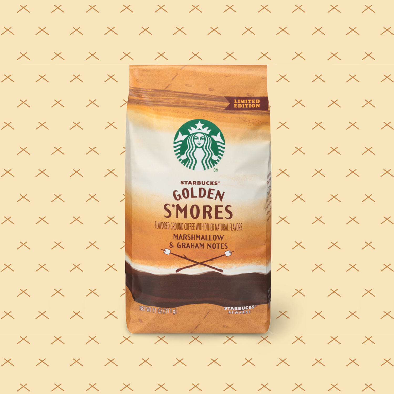


This body of work spans a range of Starbucks packaging initiatives, including seasonal limited-time offers across summer, fall, and winter, as well as the Starbucks x Nespresso at-home coffee line. Across each program, the focus was on building a flexible, system-driven approach—one that could adapt to changing products, formats, and seasons while maintaining brand consistency and clarity at scale.
Working within Starbucks’ established brand framework, I contributed to the development of packaging systems that balance hierarchy, storytelling, and functionality. From vibrant seasonal expressions to the more restrained, premium tone of the Nespresso collaboration, each solution was guided by strategic decision-making around color, typography, structure, and material—ensuring cohesion across platforms while allowing each product moment to feel distinct and intentional.
Year: 2018-2019
Company: Starbucks
Role: Packaging Design, Illustration
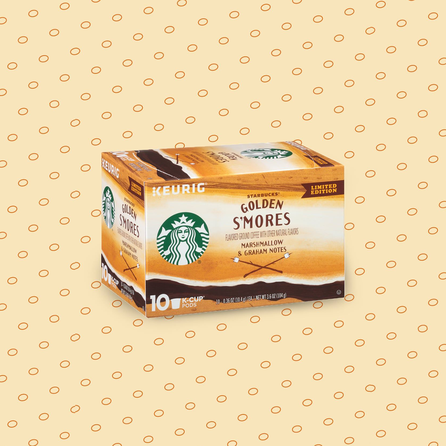
GOLDEN S’MORES
Summer LTO
For the Golden S’mores packaging, a hand-drawn illustration captures a macro view of a perfectly toasted s’more—highlighting texture, warmth, and indulgence while enhancing appetite appeal and seasonal storytelling.
The illustration system was designed to be dynamic and highly adaptable, scaling seamlessly across both K-Cup and rollstock packaging. Careful consideration was given to composition and detail so the imagery remained legible, impactful, and appetizing across formats and sizes, supporting consistency within the broader seasonal packaging system.

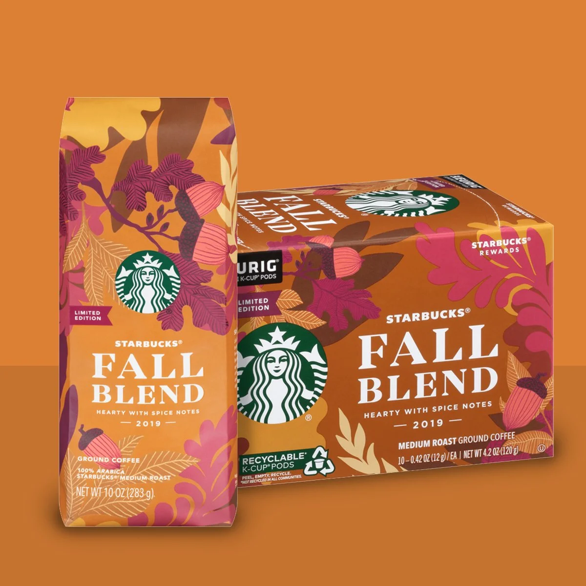
FALL BLEND
Autumn LTO
Created in collaboration with Anna von Huben, the Fall Blend packaging uses illustration to capture the warmth and richness of the season. The expressive artwork supports seasonal storytelling while maintaining clarity and cohesion within the larger Starbucks packaging system.
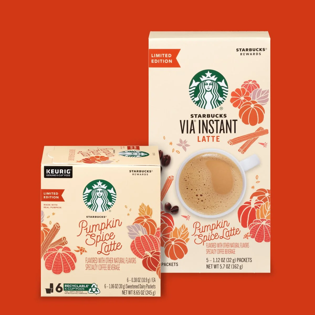
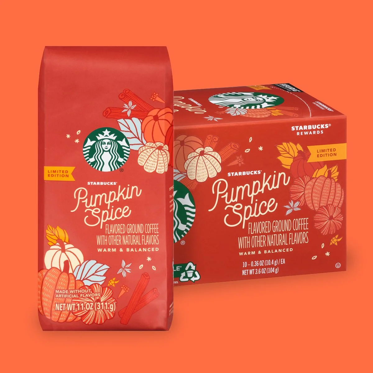
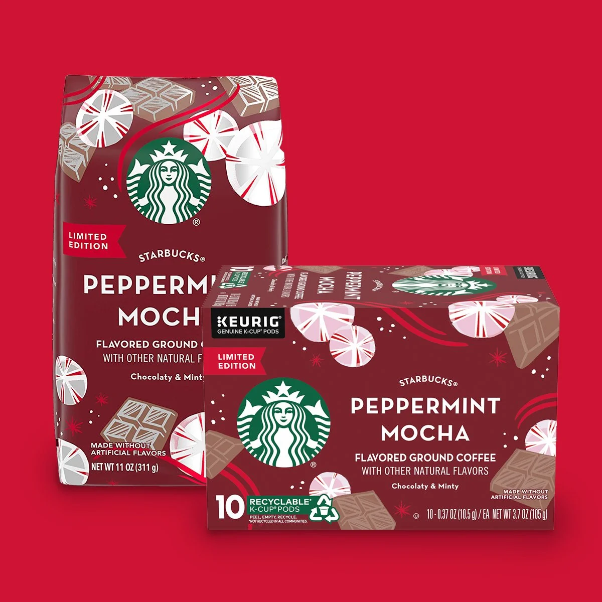
PUMPKIN SPICE & PEPPERMINT MOCHA
Autumn & Winter LTO
Developed in collaboration with illustrator Mary Stratton, the Pumpkin Spice and Peppermint Mocha packaging translated seasonal moments into expressive visual storytelling while maintaining alignment with Starbucks’ established packaging system.
Each series used illustration to capture the distinct atmosphere of its season—from the warm tones of fall to the energy of the holidays—while structured brand elements ensured clarity, scalability, and consistency across formats. Together, the designs balanced seasonal personality with brand continuity, creating recognizable moments that stood out on-shelf while remaining unmistakably Starbucks.
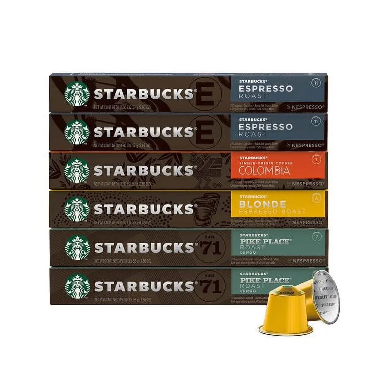
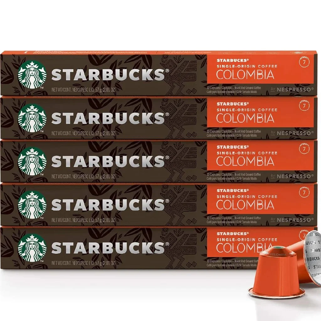
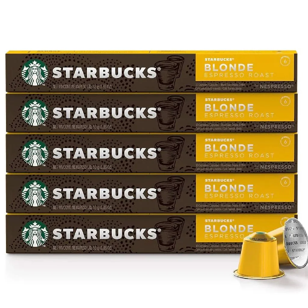
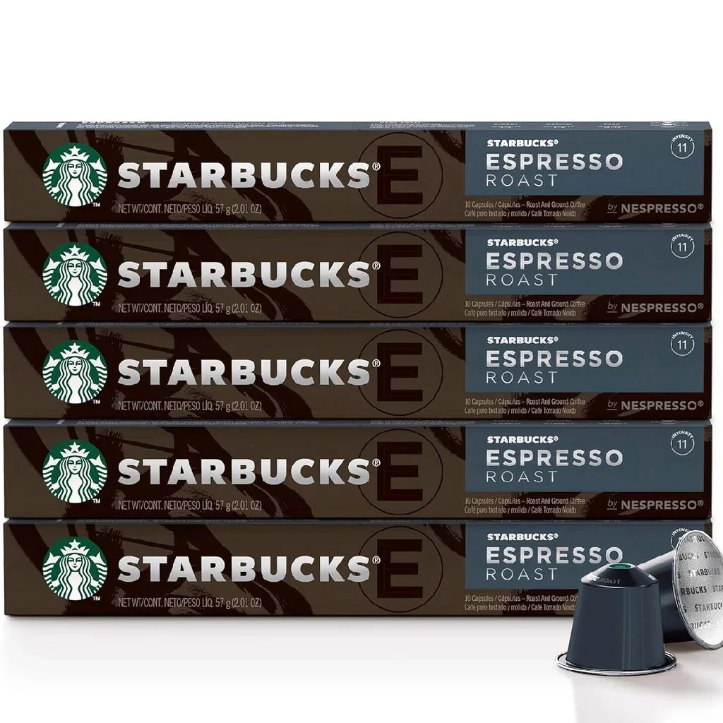
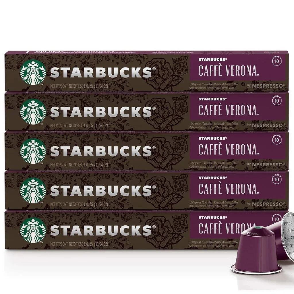
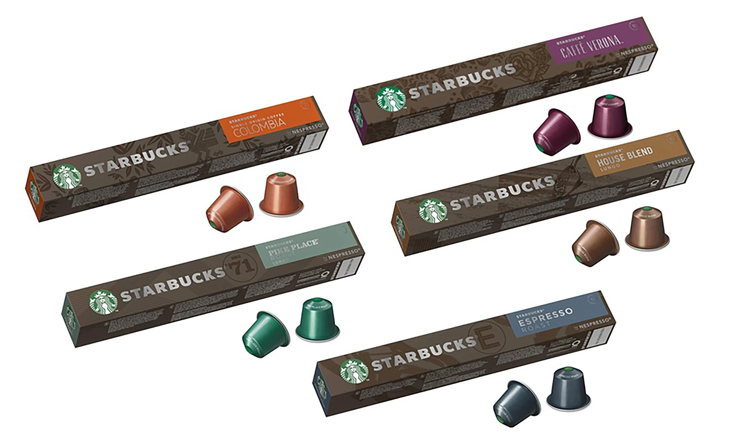
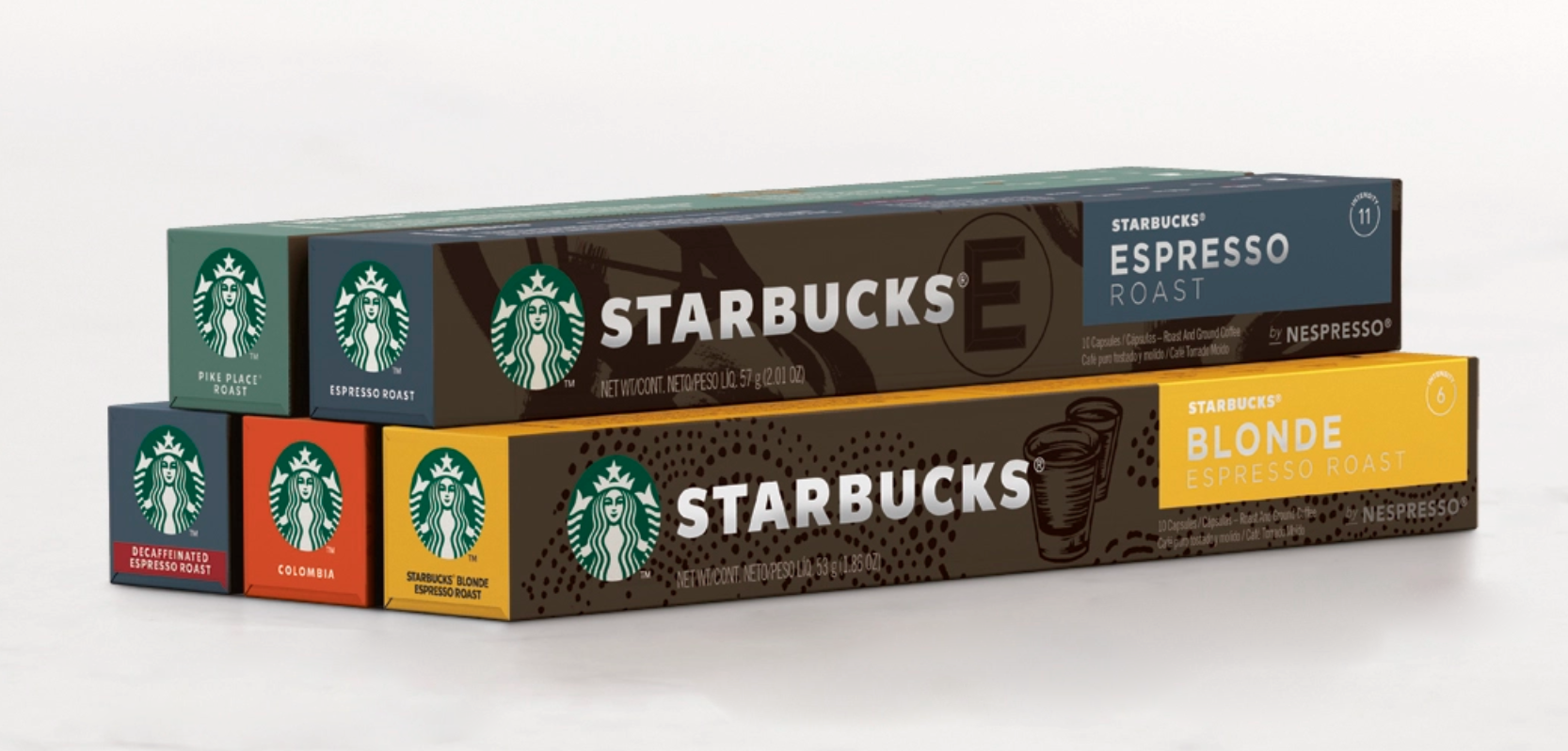
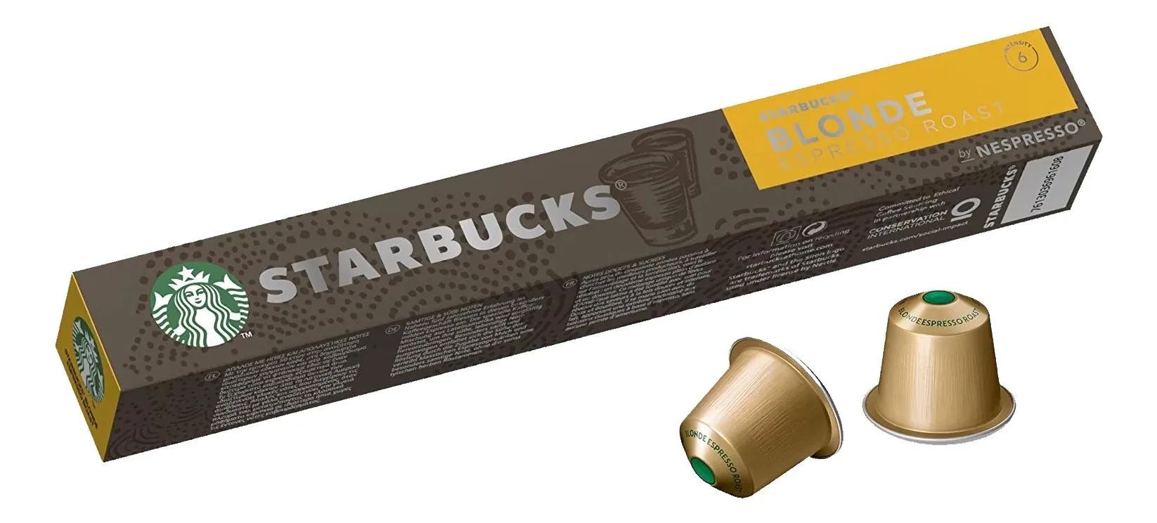
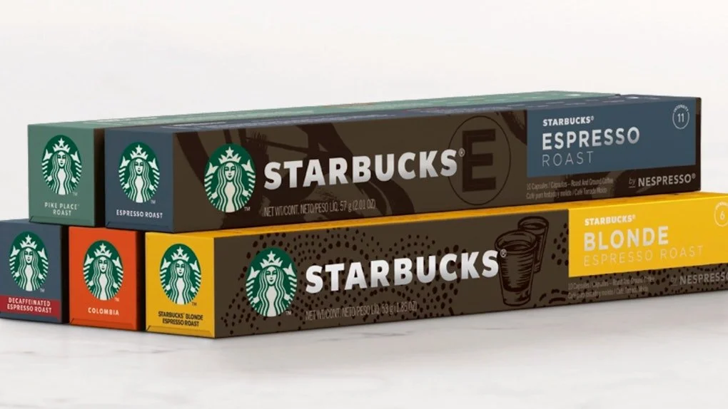
STARBUCKS X NESPRESSO
Following Starbucks’ acquisition of the Nespresso consumer packaged goods business, I was a key member of the team responsible for developing the Starbucks for Nespresso packaging suite.
The work focused on translating Starbucks’ established brand equity into a new format, creating a system that balanced premium positioning with clarity across global retail environments. Through thoughtful adaptation of color, hierarchy, and structural design, the packaging aligned with both Starbucks and Nespresso expectations while establishing a cohesive, scalable framework across blends and formats. The resulting system extended the Starbucks experience into a new category while maintaining consistency, recognition, and shelf impact.