Castle & Crown Brand Updates
Building on the foundation Kinsey Davis established with Castle & Crown Cellars, I led the creative direction for a brand update that reflected the company’s growth since 2018. Working closely with the client, I helped merge multiple design directions, expand the pairing illustration library, and refine the labels to balance clarity, elegance, and sophistication.
Key updates included moving away from the arrow mark, introducing a distinctive ampersand element, and simplifying the label system—all while preserving the original brand’s visual identity. The result is a cohesive, thoughtful brand expression that communicates both heritage and evolution.
Year: 2022
Company: Castle & Crown Cellars
Role: Brand Strategy, Visual Design, & Illustration
THE COLOR PALETTE
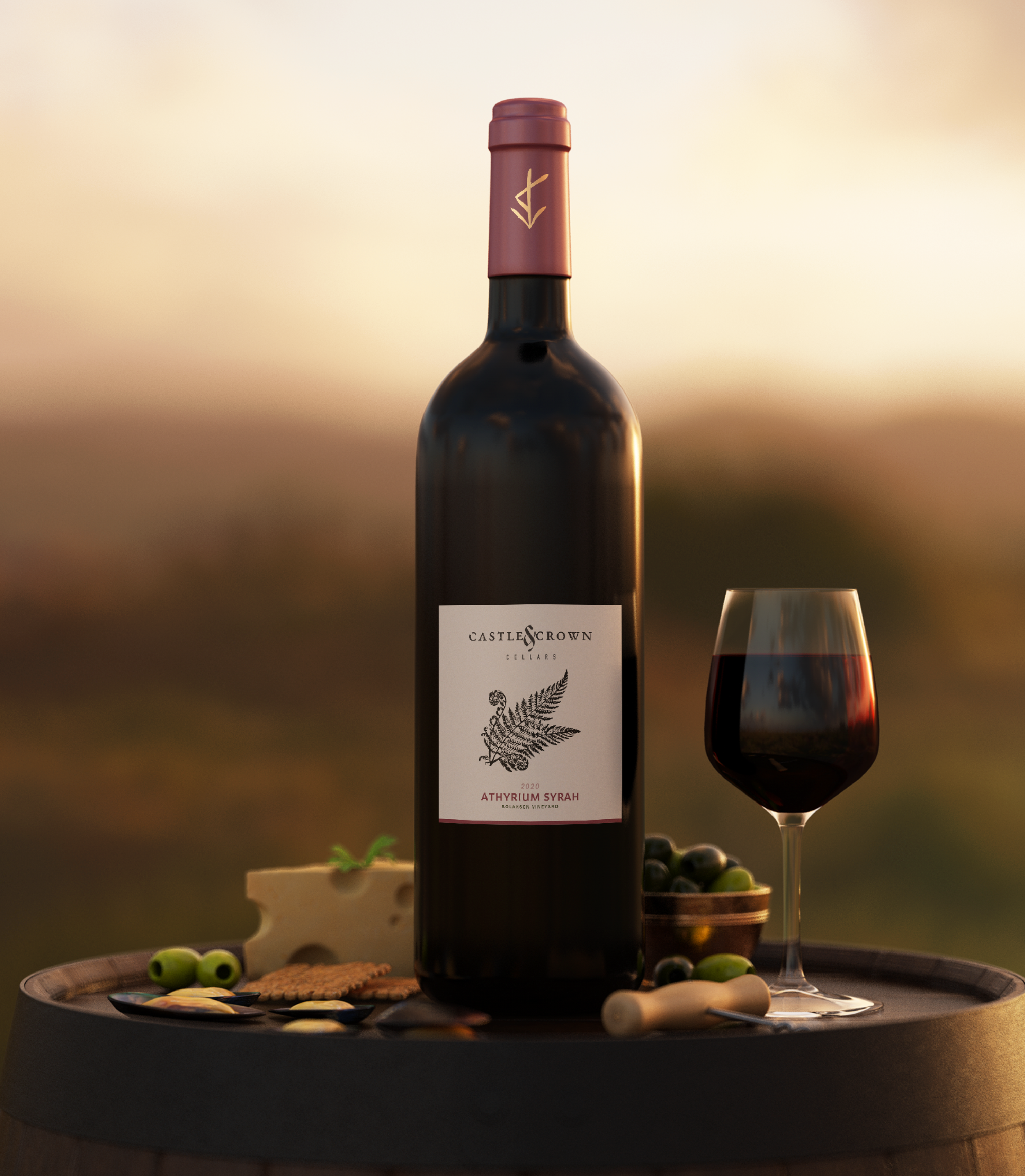
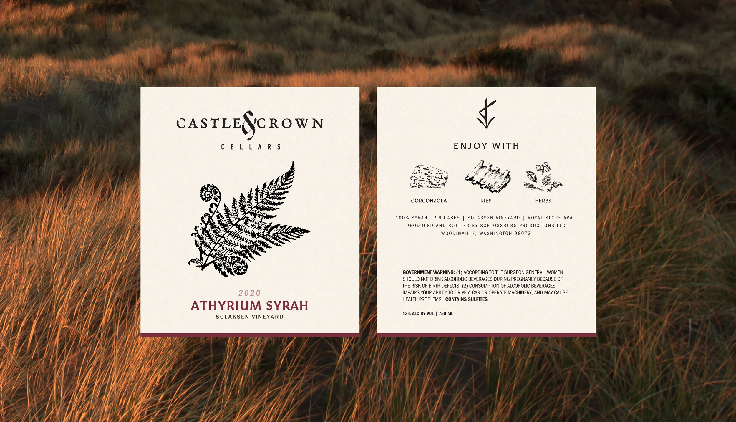
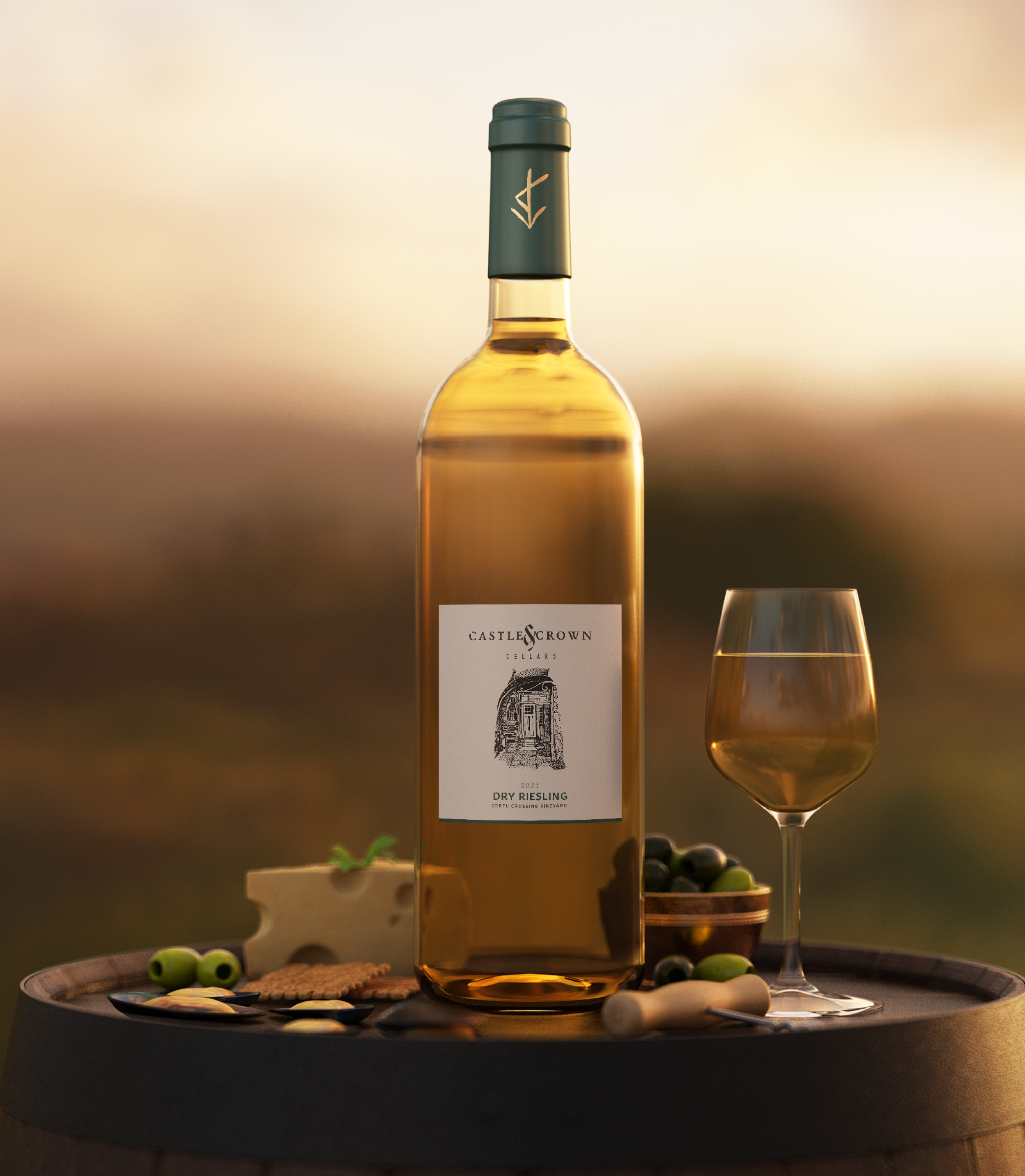
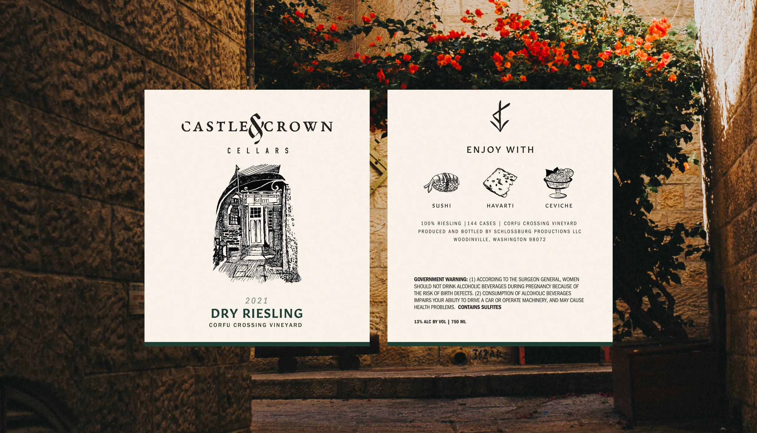
A carefully considered color palette brought cohesion across the Castle & Crown Cellars label system, allowing each label to feel distinct while supporting brand recognition and visual storytelling.
Reisling
Pinot Noir
Syrah
THE TYPOGRAPHY
The typography was refined to feel modern and minimal, allowing the color palette and illustrations to take center stage.

Franklin Gothic Condensed

Gitan Latin Semibold

Franklin Gothic Medium
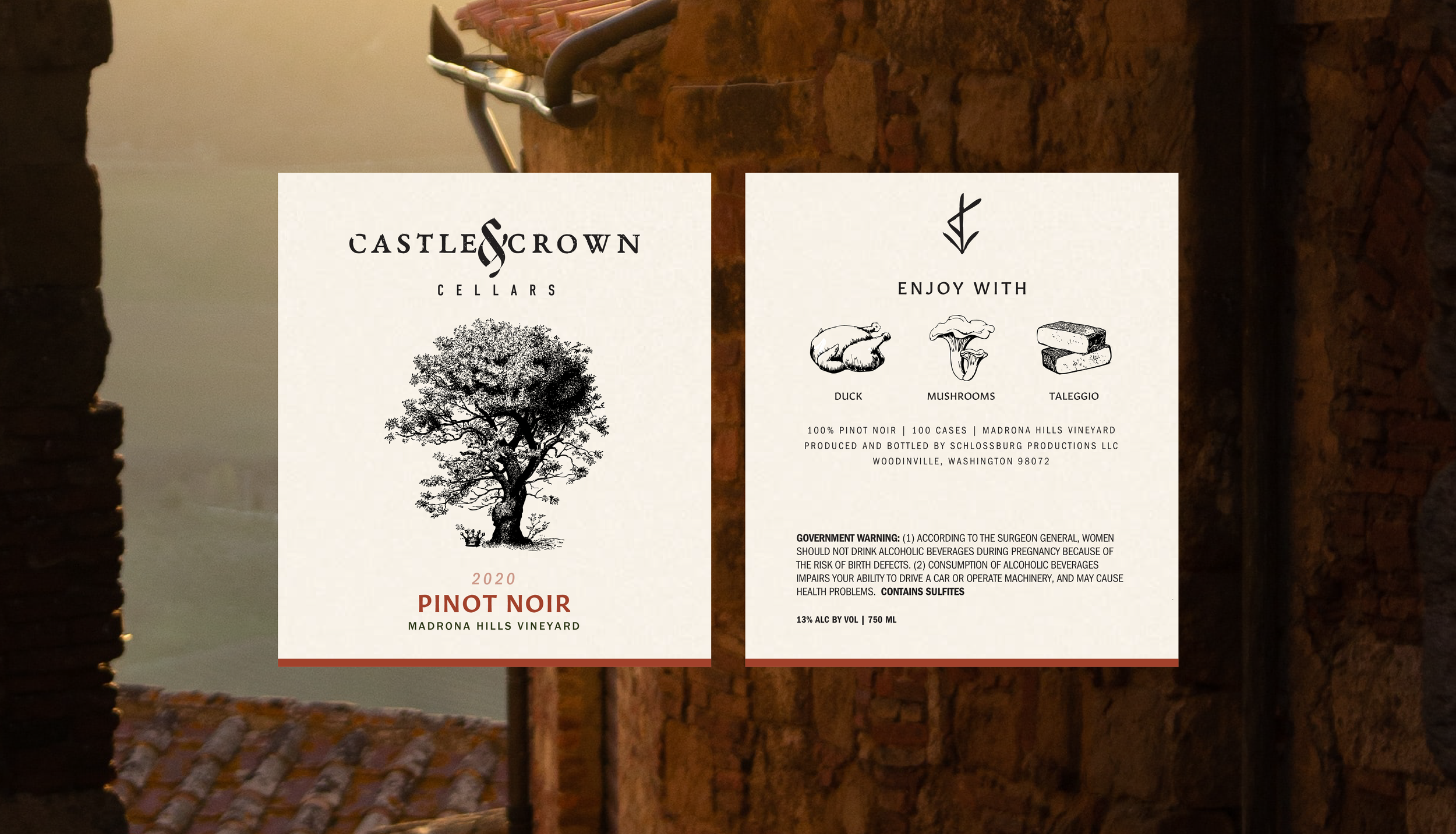
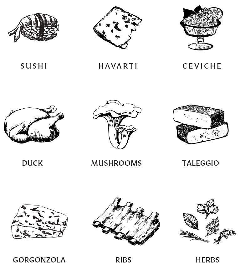
THE ILLUSTRATIONS
Illustrations inspired by etchings added distinction across the labels while also providing visual cues for pairing recommendations.


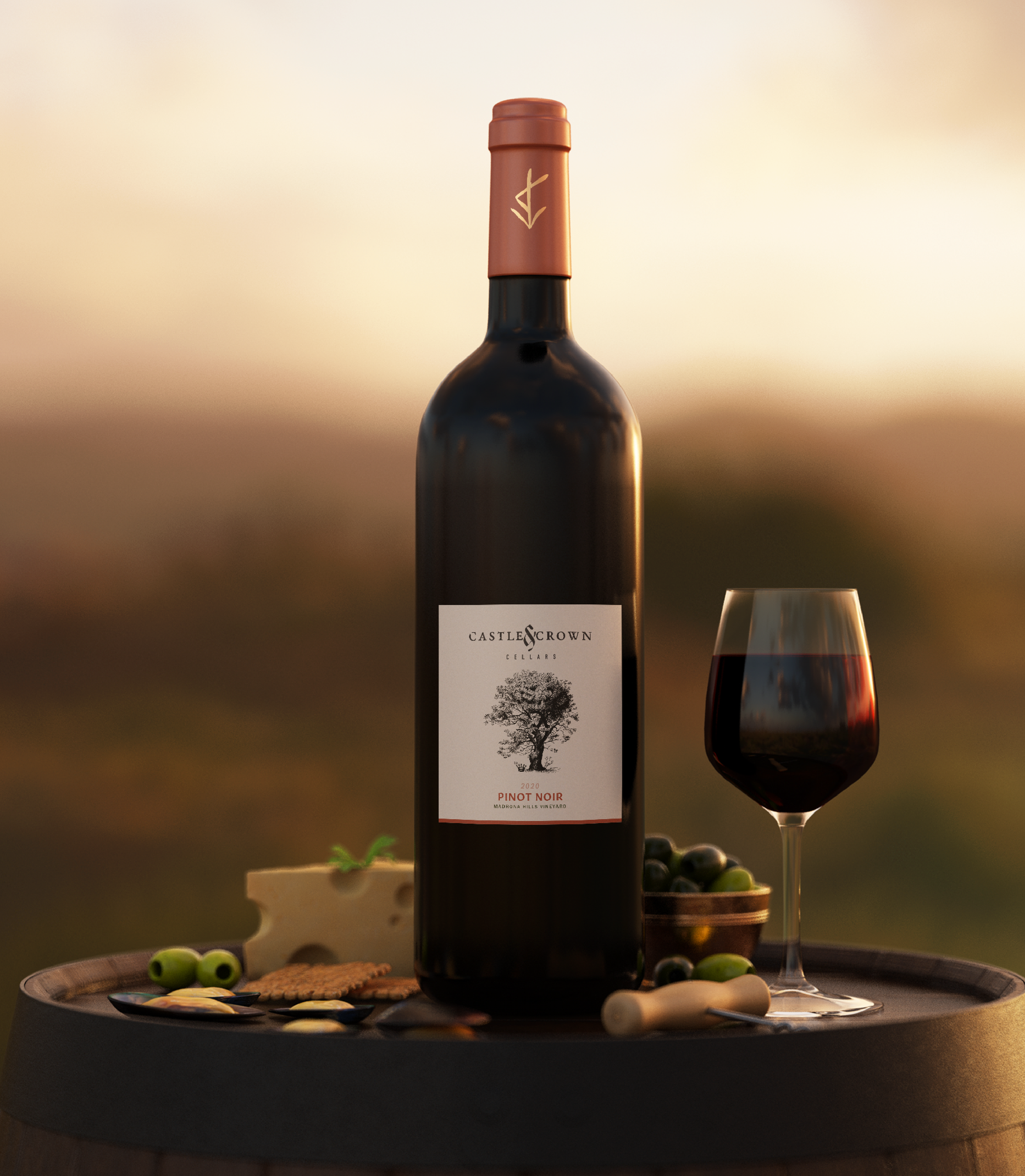
THE LABELS
The result is a label system where color, illustration, and typography work in concert—feeling both rugged and refined, and thoughtfully aligned with the brand’s evolving goals. When displayed side by side, the labels feel intentionally related, reinforcing the brand story while still allowing each wine to maintain its own character.